Come up with a design solution that increased ROI by 130x

Industry
Fintech, Healthcare
Duration
5 weeks
Category
UX Design, User Research
Tools
Figma, Miro, Hotjar, Google Analytics
Background:
To promote YesDoctor in some states of the USA, we decided to sell some non-surgical packages, which did not require surgery and were much more affordable than nose jobs or breast augmentations. As a marketing decision, we had to develop it as soon as possible.( Less than a week)
The beginning of our story was: After 2 weeks, we hadn't sold any. Really disappointing!
The marketing manager, stakeholders, product managers, and I were all very disappointed. Our most urgent and important goal now was to resolve the problem of “why we didn't sell anything and how can we fix it? ”
Business goal:
Purchasing at least 70 special package in a week!
What did I do?
1. Quantitative Research:
I checked Google Analytics and Hotjar to check users’ behavior to realize WHAT is the problem? The most important problems which I realized was:

According to Hotjar reports and recording sessions, less than 20% of visitors scrolled the landing page. (It meant the landing page wasn’t attractive for users)
After understanding that they should give us private information like their address or Social Security number, all users abandon the form! (Which means they are not okay with share these information with us)
2. Qualitative Research:
After that, I interviewed five people in our focus group to define HOW and WHY it happened (our focus group included 25 people undergoing plastic surgery with our doctors, and five people were available to speak with me, I made this community to have a better understanding due to cultural differences and connect with some of our target users).
Through in-depth interviews with our focus group, I identified some significant misunderstandings:
We wanted to influence our audience by telling some attractive deal information, we said you can apply with $X monthly But it wasn’t clear how long? and it made users confused about the whole cost of this package.
Filling in all the information at the first step made them uncomfortable, they didn’t realize anything about the special package and we forced them (somehow) to give us their personal information.
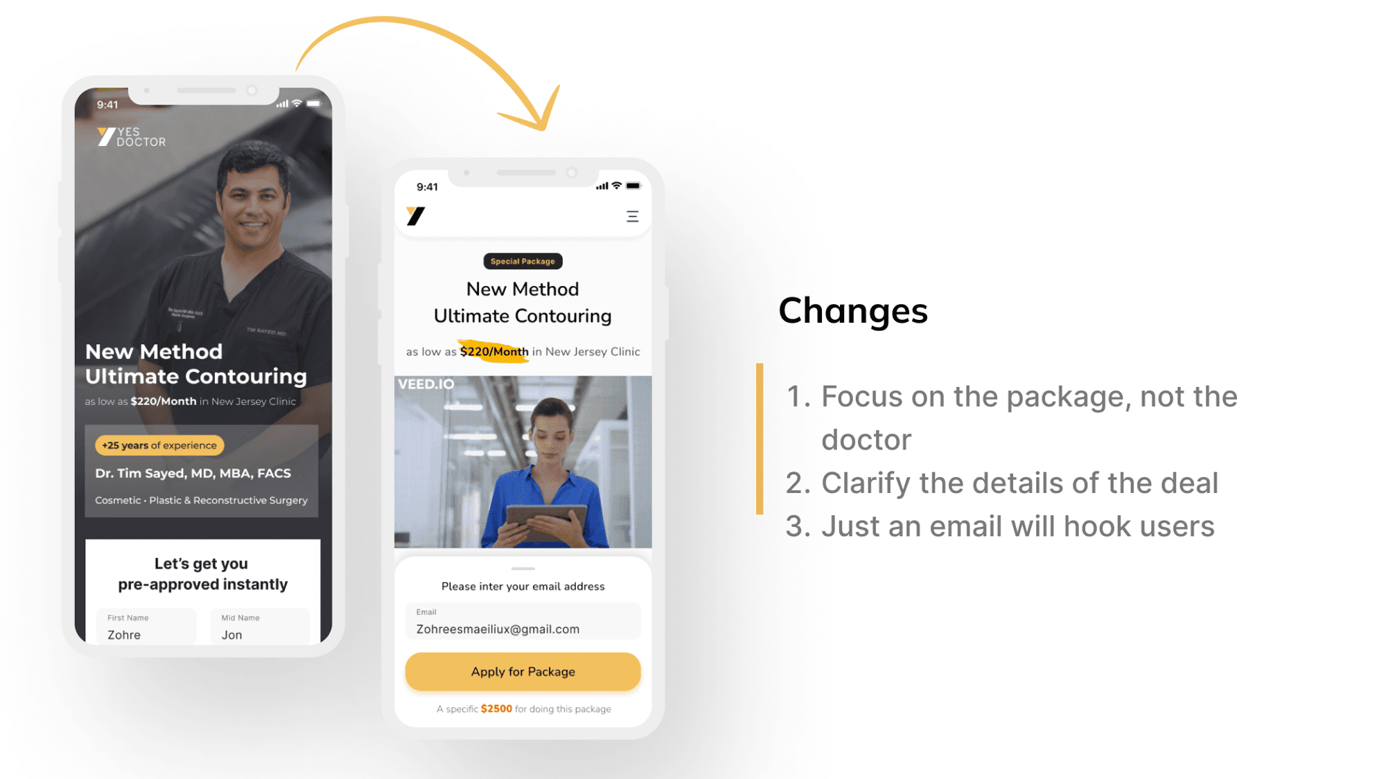
The marketing team wanted to use top doctor pictures to make an attractive first impression with those reputations (we worked with top doctors in US), but they wanted to know more about the package not doctor! The special package is non-surgical, and the details of the process or devices which will be used in the process are more important than the doctor!
3. Design Result:
Based on all the information that I collected from target users and analytics platform I decided to change landing page :
Changed IA ( Information Architecture) in a more handy way which helps users start and continue their path based on their situation.

Check out the image's detail here.
I've divided information into steps, to clarify what we need and how many steps they should take.
Start the journey with just a simple step, Inserting an Email address. This change helped us not only for increasing user attraction but also if they just left their email in the box, the marketing team was able to contact them.
Check out the image's detail here.
We decided to remove Social Security Number field and receive their bank information just from their address (risk of these loans were low and no one likes to give SSN to other)

Check out the image's detail here.
We sold more than 130 Special package in 3 days! 😍😍
What I've learned?
Improving my negotiation skills to convince stakeholders to spend more time researching before designing to empathize with them as much as possible, not only because of a user-centered design approach, but also to increase business revenue!
Getting more familiar with target user's assumption!
What did we do for future?
Set some analytical points to track changes, like the effect of asking for an email in hooking process!
Conduct an A/B test to track users' responses to different hero sections.
Come up with a design solution that increased ROI by 130x
Industry
Fintech, Healthcare
Duration
5 weeks
Category
UX Design, User Research
Tools
Figma, Miro, Hotjar, Google Analytics
Background:
To promote YesDoctor in some states of the USA, we decided to sell some non-surgical packages, which did not require surgery and were much more affordable than nose jobs or breast augmentations. As a marketing decision, we had to develop it as soon as possible.( Less than a week)
The beginning of our story was: After 2 weeks, we hadn't sold any. Really disappointing!
The marketing manager, stakeholders, product managers, and I were all very disappointed. Our most urgent and important goal now was to resolve the problem of “why we didn't sell anything and how can we fix it? ”
Business goal:
Purchasing at least 70 special package in a week!
What did I do?
1. Quantitative Research:
I checked Google Analytics and Hotjar to check users’ behavior to realize WHAT is the problem? The most important problems which I realized was:
According to Hotjar reports and recording sessions, less than 20% of visitors scrolled the landing page. (It meant the landing page wasn’t attractive for users)
After understanding that they should give us private information like their address or Social Security number, all users abandon the form! (Which means they are not okay with share these information with us)
2. Qualitative Research:
After that, I interviewed five people in our focus group to define HOW and WHY it happened (our focus group included 25 people undergoing plastic surgery with our doctors, and five people were available to speak with me, I made this community to have a better understanding due to cultural differences and connect with some of our target users).
Through in-depth interviews with our focus group, I identified some significant misunderstandings:
We wanted to influence our audience by telling some attractive deal information, we said you can apply with $X monthly But it wasn’t clear how long? and it made users confused about the whole cost of this package.
Filling in all the information at the first step made them uncomfortable, they didn’t realize anything about the special package and we forced them (somehow) to give us their personal information.
The marketing team wanted to use top doctor pictures to make an attractive first impression with those reputations (we worked with top doctors in US), but they wanted to know more about the package not doctor! The special package is non-surgical, and the details of the process or devices which will be used in the process are more important than the doctor!
3. Design Result:
Based on all the information that I collected from target users and analytics platform I decided to change landing page :
Changed IA ( Information Architecture) in a more handy way which helps users start and continue their path based on their situation.
Check out the image's detail here.
I've divided information into steps, to clarify what we need and how many steps they should take.
Start the journey with just a simple step, Inserting an Email address. This change helped us not only for increasing user attraction but also if they just left their email in the box, the marketing team was able to contact them.
Check out the image's detail here.
We decided to remove Social Security Number field and receive their bank information just from their address (risk of these loans were low and no one likes to give SSN to other)
Check out the image's detail here.
We sold more than 130 Special package in 3 days! 😍😍
What I've learned?
Improving my negotiation skills to convince stakeholders to spend more time researching before designing to empathize with them as much as possible, not only because of a user-centered design approach, but also to increase business revenue!
Getting more familiar with target user's assumption!
What did we do for future?
Set some analytical points to track changes, like the effect of asking for an email in hooking process!
Conduct an A/B test to track users' responses to different hero sections.
Come up with a design solution that increased ROI by 130x
Fintech, Healthcare
5 weeks
UX Design, User Research
Tools
Figma, Miro, Hotjar, Google Analytics
Background:
To promote YesDoctor in some states of the USA, we decided to sell some non-surgical packages, which did not require surgery and were much more affordable than nose jobs or breast augmentations. As a marketing decision, we had to develop it as soon as possible.( Less than a week)
The beginning of our story was: After 2 weeks, we hadn't sold any. Really disappointing!
The marketing manager, stakeholders, product managers, and I were all very disappointed. Our most urgent and important goal now was to resolve the problem of “why we didn't sell anything and how can we fix it? ”
Business goal:
Purchasing at least 70 special package in a week!
What did I do?
1. Quantitative Research:
I checked Google Analytics and Hotjar to check users’ behavior to realize WHAT is the problem? The most important problems which I realized was:
According to Hotjar reports and recording sessions, less than 20% of visitors scrolled the landing page. (It meant the landing page wasn’t attractive for users)
After understanding that they should give us private information like their address or Social Security number, all users abandon the form! (Which means they are not okay with share these information with us)
2. Qualitative Research:
After that, I interviewed five people in our focus group to define HOW and WHY it happened (our focus group included 25 people undergoing plastic surgery with our doctors, and five people were available to speak with me, I made this community to have a better understanding due to cultural differences and connect with some of our target users).
Through in-depth interviews with our focus group, I identified some significant misunderstandings:
We wanted to influence our audience by telling some attractive deal information, we said you can apply with $X monthly But it wasn’t clear how long? and it made users confused about the whole cost of this package.
Filling in all the information at the first step made them uncomfortable, they didn’t realize anything about the special package and we forced them (somehow) to give us their personal information.
The marketing team wanted to use top doctor pictures to make an attractive first impression with those reputations (we worked with top doctors in US), but they wanted to know more about the package not doctor! The special package is non-surgical, and the details of the process or devices which will be used in the process are more important than the doctor!
3. Design Result:
Based on all the information that I collected from target users and analytics platform I decided to change landing page :
Changed IA ( Information Architecture) in a more handy way which helps users start and continue their path based on their situation.
Check out the image's detail here.
I've divided information into steps, to clarify what we need and how many steps they should take.
Start the journey with just a simple step, Inserting an Email address. This change helped us not only for increasing user attraction but also if they just left their email in the box, the marketing team was able to contact them.
Check out the image's detail here.
We decided to remove Social Security Number field and receive their bank information just from their address (risk of these loans were low and no one likes to give SSN to other)
Check out the image's detail here.
We sold more than 130 Special package in 3 days! 😍😍
What I've learned?
Improving my negotiation skills to convince stakeholders to spend more time researching before designing to empathize with them as much as possible, not only because of a user-centered design approach, but also to increase business revenue!
Getting more familiar with target user's assumption!
What did we do for future?
Set some analytical points to track changes, like the effect of asking for an email in hooking process!
Conduct an A/B test to track users' responses to different hero sections.
Come up with a design solution that increased ROI by 130x
Industry
Fintech, Healthcare
Duration
5 weeks
Category
UX Design, User Research
Tools
Figma, Miro, Hotjar, Google Analytics
Background:
To promote YesDoctor in some states of the USA, we decided to sell some non-surgical packages, which did not require surgery and were much more affordable than nose jobs or breast augmentations. As a marketing decision, we had to develop it as soon as possible.( Less than a week)
The beginning of our story was: After 2 weeks, we hadn't sold any. Really disappointing!
The marketing manager, stakeholders, product managers, and I were all very disappointed. Our most urgent and important goal now was to resolve the problem of “why we didn't sell anything and how can we fix it? ”
Business goal:
Purchasing at least 70 special package in a week!
What did I do?
1. Quantitative Research:
I checked Google Analytics and Hotjar to check users’ behavior to realize WHAT is the problem? The most important problems which I realized was:
According to Hotjar reports and recording sessions, less than 20% of visitors scrolled the landing page. (It meant the landing page wasn’t attractive for users)
After understanding that they should give us private information like their address or Social Security number, all users abandon the form! (Which means they are not okay with share these information with us)
2. Qualitative Research:
After that, I interviewed five people in our focus group to define HOW and WHY it happened (our focus group included 25 people undergoing plastic surgery with our doctors, and five people were available to speak with me, I made this community to have a better understanding due to cultural differences and connect with some of our target users).
Through in-depth interviews with our focus group, I identified some significant misunderstandings:
We wanted to influence our audience by telling some attractive deal information, we said you can apply with $X monthly But it wasn’t clear how long? and it made users confused about the whole cost of this package.
Filling in all the information at the first step made them uncomfortable, they didn’t realize anything about the special package and we forced them (somehow) to give us their personal information.
The marketing team wanted to use top doctor pictures to make an attractive first impression with those reputations (we worked with top doctors in US), but they wanted to know more about the package not doctor! The special package is non-surgical, and the details of the process or devices which will be used in the process are more important than the doctor!
3. Design Result:
Based on all the information that I collected from target users and analytics platform I decided to change landing page :
Changed IA ( Information Architecture) in a more handy way which helps users start and continue their path based on their situation.
Check out the image's detail here.
I've divided information into steps, to clarify what we need and how many steps they should take.
Start the journey with just a simple step, Inserting an Email address. This change helped us not only for increasing user attraction but also if they just left their email in the box, the marketing team was able to contact them.
Check out the image's detail here.
We decided to remove Social Security Number field and receive their bank information just from their address (risk of these loans were low and no one likes to give SSN to other)
Check out the image's detail here.
We sold more than 130 Special package in 3 days! 😍😍
What I've learned?
Improving my negotiation skills to convince stakeholders to spend more time researching before designing to empathize with them as much as possible, not only because of a user-centered design approach, but also to increase business revenue!
Getting more familiar with target user's assumption!
What did we do for future?
Set some analytical points to track changes, like the effect of asking for an email in hooking process!
Conduct an A/B test to track users' responses to different hero sections.

